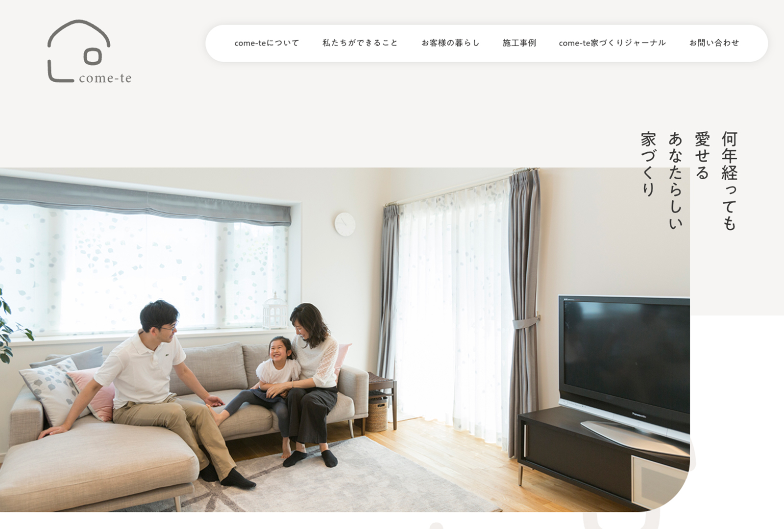
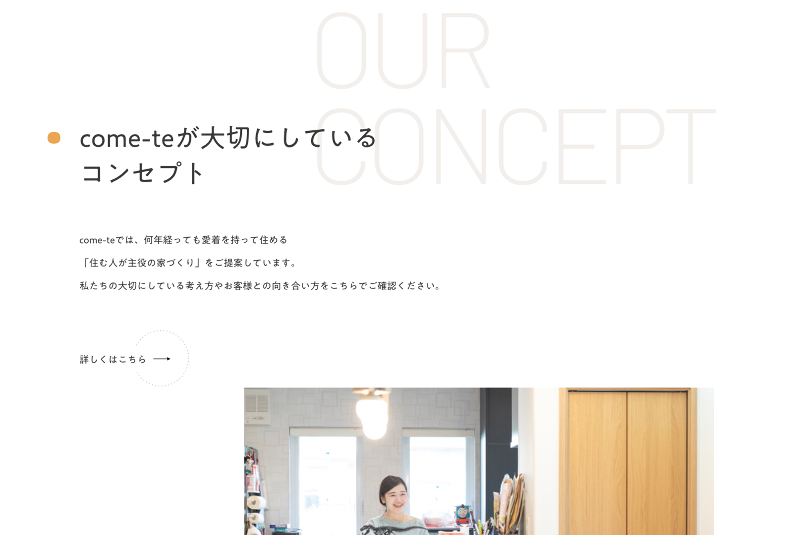
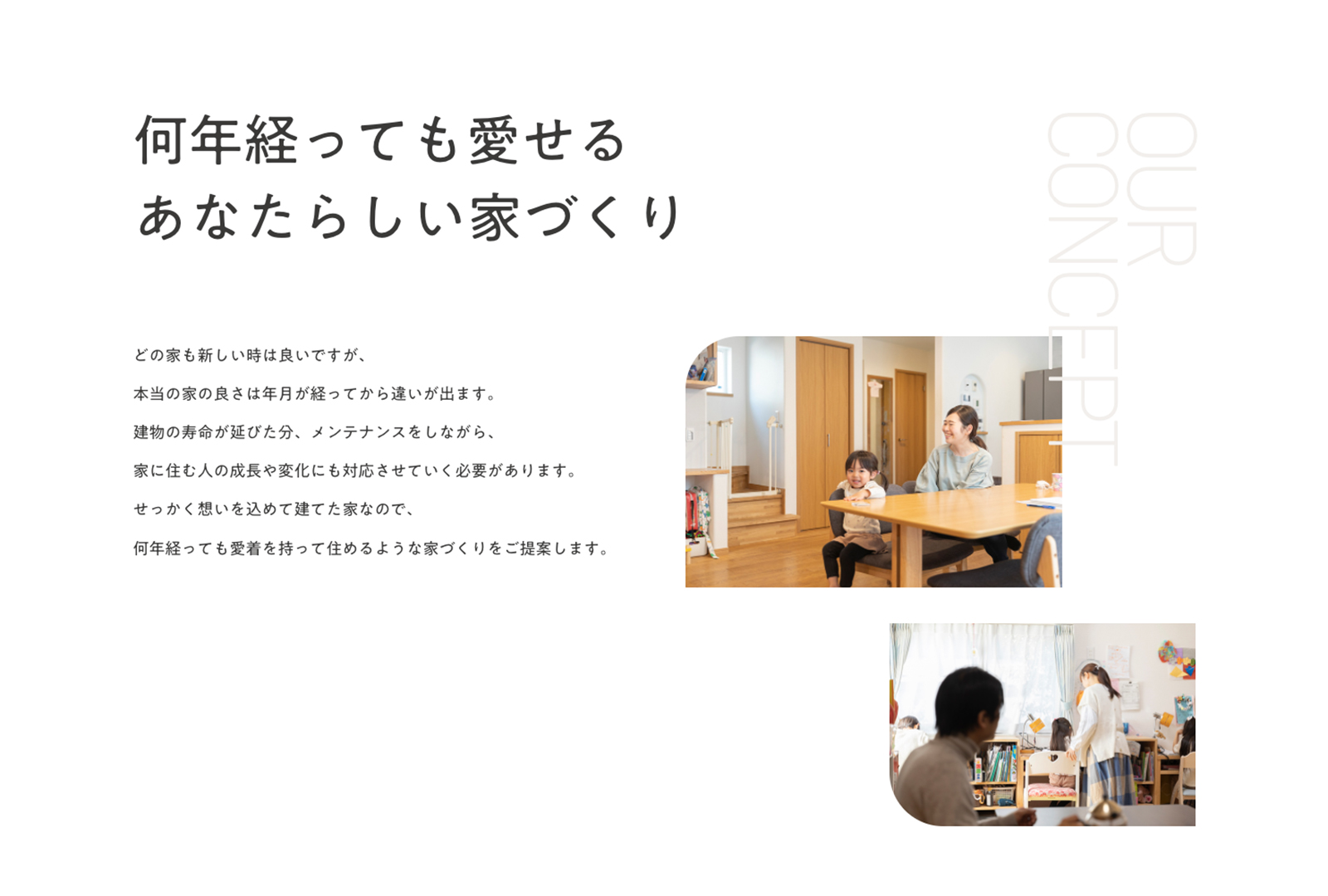
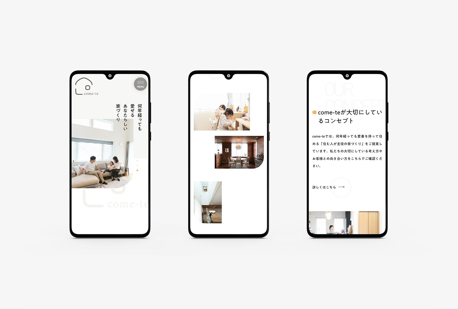
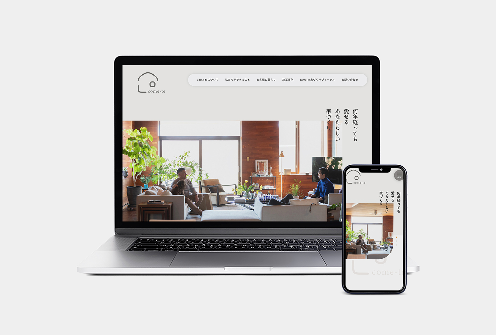
I designed the website for “Come-te”, an architectural company.
They wanted to re-brand, so I made the atmosphere of their website softer by putting a curve to some images and choosing warm colors. I also made the information easier to read than before.
I am very glad that they like their new website a lot.
